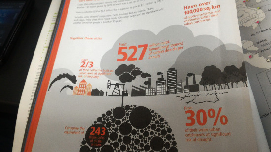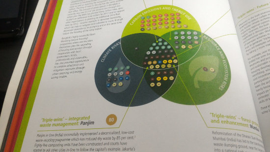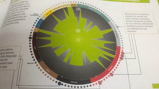

As part of the development of the next Socio-Ecological Profile for the year 2016, we have decided to make the data presentation more illustrative & interactive. Noticed that from the previous profiles published, it was all just tables and numbers. Turning them into graphs, diagrams and the like can only become user-friendly but also eye-catching and understandable to most readers.
Now I only need to find a free online software for easy conversion of these data. Here are a few examples as based on a reference book entitled “Future Proofing Cities” which Dolly let me borrow.